WHAT SIZE SHOULD WEDDING SIGNAGE BE?
- LouPaper
- Jun 21, 2024
- 3 min read
What Size Should Wedding Signage Be?
When you’re planning wedding signage there are a few things to consider, to get the sizes right for your big day. The first thing to think about is your wedding venue and where the wedding signage will be placed. If your venue has a wedding planner or wedding events co-ordinator then ask for their advice. During a tour of the venue have a look at where the signage could be placed and ask if there are any stands or easels provided that you can use. Ask for their recommendations and request examples of previous weddings so you can get a feel for how yours could look. Their Instagram account might show some good examples of signage placement too. If you are having a marquee wedding speak to the supplier about their recommendations too.

Mindy Coe
The next thing to consider is the overall size of the space you are working with. If you’re having a small intimate wedding you can go for smaller signage but if you have lots of room and lots of guests I recommend going for larger signage. Otherwise small signs in large spaces just get lost.
I design the on the day stationery to be consistent with the save the dates and wedding invitations. So everything has a cohesive styled look on the wedding day. If you have a strong colour palette then every piece of stationery is a chance to make the colour pop! If you’re looking for inspiration have a browse of the wedding stationery collections.
Wedding welcome sign
The wedding welcome sign sets the tone for the day and welcomes your guests in style. I usually recommend A1 size because the welcome sign provides a gorgeous styling opportunity and photo moment, accessorised with the wedding florals. Some of my wedding couples chose to have their welcome sign combined with an order of the day. Again it comes down to the space you have available.

If you have the order of the day as a separate sign I recommend keeping it as a consistent size to the welcome sign. I love how frosted perspex looks for a sign background.

Kirsty Mackenzie
Welcome signs and order of the day signs can be displayed in many different ways. Some wedding venues have easels you can borrow.

Matthew Lawerence
Or if you’re having an outdoor or destination wedding then welcome and order of the signs look great printed on fabric and hung from something! They also travel well!

Table Plan Sign
An essential part of the wedding signage is the table plan. This sign needs to be big enough for all guests to be able to read the details of where they are sitting, including your older guests who may find small fonts hard to read. The table sign also needs to be easily accessible by all of your guests.
I usually recommend A1 for 75-100 guests, A2 can be used for smaller weddings and larger guest lists I'd recommend a large A0 plan, or sometimes printing 2 of the A1 size.

Jacques Lloyd

Chloe Caldwell
Table Numbers/Names
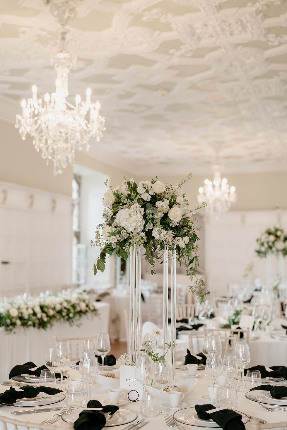
Displayed on each of the wedding tables, the table number or name signs are an opportunity to showcase your wedding colour palette and style. A5 is generally a good size so the table name or number can be found easily by guests.

Chloe Caldwell

Romy Lawerence
Bespoke Signs
I love designing bespoke signs for the wedding day and the signs can be created for anything you would like to draw your guests’ attention too. Some popular bespoke signs are the bride and groom’s signature drink or cocktail choice. Other popular bespoke signs for couples are the guestbook, the flavours of the cake and a sign for cards and gifts. I recommend having these signs in A5 or A4 so they stand out.


Nicola Drummond
Some couples chose to have larger bespoke signs too, perhaps for a beautiful quote or something meaningful to them! There really is no limit to what you chose for your wedding day!

Safrina Smith
Personalised Wedding Signage
Have a browse through my website for more wedding day signage ideas. There’s lots of inspiration on my Instagram and Pinterest accounts too!
Please get in touch with me here to discuss your wedding signage and stationery requirements for your wedding day. I advise allowing around 8-10 weeks before your wedding day to allow enough time to have everything ready. I’m excited to hear from you!


Comments